Sunday, 14 March 2010

Evaluation7: Looking at your preliminary task (the school magazine task), what do you feel you have learnt in the progression from it to full product?


As you can see from my blog I have managed my time well by continually working on my task and uploading my work as I went along. I did this by setting myself a small task each night so that I ended up with all the elements I needed for the production of my final pieces, including research and planning, the construction and evaluation.

On my preliminary task I am happy with the quality of the photos but not with the design. I like the fact I picked out colours from the photo on the front and used them in my contents page (green), which I have done for my main task too, using the colour maroon through out. However, on my preliminary task's front cover and contents page there is far too much negative space that needs to be filled which makes the magazine look as if it has hardly anything inside. In comparison I have included lots of information on the front cover and contents page of my main task which makes it look as if the magazine is packed with information the reader wants to know about.

When completing this project I found it difficult to get a picture for my front cover that I wanted so I had to many photo shoots. I was first not happy with my model, so I got a new model, then when I did not like the quality of the photos for a front cover image I took some more photos and received the picture I wanted.

I originally wanted a plain wall for the background of my front cover as this is what many music and general magazine covers have, however I was not happy with what I was generating using a white background so I decided to use a different idea and used a brick wall for the background, I was extremely pleased with the result and even more satisfied once I had edited the photo.

I have learnt that a medium close up is good for a front cover of a magazine, as it shows nearly all elements of the costume, excluding the shoes, allows the reader to recognise who the person is and it lets you see the facial expression they are pulling. For both tasks on the front cover I had the model in the centre so that I could surround them with information like the magazines below.


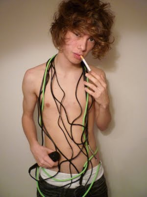
After researching different music magazines and seeing that they rarely used props on their front cover I still wanted to try out an idea that I had in my mind, which was to have my model topless with wires (having connotations to the music scene due to guitar and microphone leads). When I had done this I was not overly happy with the results so decided against this idea and would put the model in 'normal' clothes.


If you compare my layouts to my final productions at the top, you can see that I have followed the design, and as I had this guidance in the making of my front cover, contents page and double page spread I found them easier to complete and am now pleased with how they have turned out.

Feedback Throughout Production
When asking for feedback through out the production of my magazine cover I found that many of them said that they did not think the album cover ‘suited’ the rest of the magazine and that the photo needed to be of ‘better quality. I had allowed myself enough time so I could improve this problem and therefore I deleted the album cover and replaced it with a win tickets to see infected symbol. Once I had placed this in the feedback was much more positive and said that it was ‘much better’ and that it now ‘suits the rest of the magazine’.

Also whilst producing my front cover I tried a different design and I asked a peer what they thought of the design and said they thought ‘the original design is better’ and that I ‘should stick with my first idea’. I took this advice and am now extremely pleased with my final product following my initial design.

When producing my contents page I was unsure on the paint splat background so I asked different people with in my class and I had some very positive responses which were:
‘It looks messy, but in a good way, like most magazines have.’
‘I think you should keep it as music is to do with creativeness, which could also be reflected in art’
‘I understand why you might not like it, but it works with the other elements on the page so I think you should keep it’
I took their advice and I am really pleased with the final product.

Saturday, 13 March 2010

Evaluation 6: What have you learnt about technologies from the process of constructing this product?

I have used two new softwares to produce my front cover, contents page and double page spread; these are Photoshop CS4 and InDesign. I had never used the software before so to guide me I used the help tool and the CDs that come with the software.
To produce my front cover, contents page and double page spread I used the software Photoshop. My full production of the front page and contents page were generated on photoshop where as I only generated the elements on photoshop for my double page spread and then made it on InDesign. I used various tools to produce my final pieces which are shown below.

Click on the below images to enlarge


I used the brightness and contrast adjustment on some of my photos to make their quality look greater.
Once I had created the different elements for my double page spread in photoshop (edited the photo, created the title, made the silence symbol in the bottom left and made the website symbol in the bottom right). I placed all of these elements into InDesign so that I could use columns to enter all of my text. At first I was unsure how to make the text flow from one column to the next so I used the help CD for InDesign to overcome this problem. Once I had all of my columns inserted with the text in them I used Text Wrap so that the writing next to the model flowed around his body; I indented it a few 3 mm so that it was not touching him.

To take my photos I used a standard digital camera and then uploaded them on to the computer.

Friday, 12 March 2010

Evaluation 5: How did you attract/address your audience?


There are many similar aspects of my magazine front cover that relate to Kerrang!
The blue circle reveals on both a free posters section is available with in the magazine. I have included this on my front cover as it will encourage more readers to buy the issue as they may want the posters to stick on their wall, which many teenagers seem to enjoy doing.
Two of the bands that I have included are also on Kerrang! which are Fall Out Boy and Paramore, this reveals that I have selected bands that the audience will be interested in as this magazines has a similar target audience.
On both covers smaller photos have been included to reveal what can be found inside. The continuous use of capital letters and the busy nature of the of the two issues makes the magazine seem full of information so that the reader will think they are getting their moneys worth.
The dark coloured clothing of the model(s) reveals the darker theme of music they play which the reader will see and so will be more interested in buying the magazine.
Similarly I have included a main image of the person I will be doing the greatest interview on in my magazine, which Kerrang! have done too.

My unique selling point is the fact I have included the top ten songs of the decade, as it is not everyday that a decade finishes so people will be intrigued to see what people who like the same genre of music as them think the top songs are and if they have not heard of some of them then they may want to look them up.
In my double page spread my mode of address is very friendly and welcoming to make it seem as if the reader is part of the conversation, this will entice them to read on to find out what the artist has to say.

Evaluation 4: Who would be the audience for your media product?

Socio-economic categories are used to group different types of people. These different sectors are:

A- Higher managerial, administrative, professional e.g. Chief executive, senior civil servant, surgeon


B - Intermediate managerial, administrative, professional e.g. bank manager, teacher


C1- Supervisory, clerical, junior managerial e.g. shop floor supervisor, bank clerk, sales person


C2 - Skilled manual workers e.g. electrician, carpenter


D- Semi-skilled and unskilled manual workers e.g. assembly line worker, refuse collector, messenger


E - Casual labourers, pensioners, unemployed e.g. pensoiners without private pensions and anyone living on basic benefits


However, many magazine publishers target their magazines towards teenagers, as am I, so find that they do not fit in to a socio-economic group as they are still students and so do not have permanent jobs. Instead magazine publishers and editors have begun separating the these people in to different social groups which teenagers have made up themselves. Some of the following can be seen below:

Emos: It started in the 1980s hardcore punk movement of Washington, D.C., where it was known as "emotional hardcore" or "emocore". People who are emo are thought to be emotionally distressed, the music they produce is sombre and depressing with lyrics complaining how terrible their life is, they all supposedly self harm and do not want to eat as they want to be as skinny as possible.

Chavs: They are thought to be agressive teenagers, unemployed and engage in anti-social behaviour on the streets (drugs and drink included). Due to their negative effect on society many of the older generation think all young people are anti-social and rude when this is not the case.

Trendies: They fill a large majority of the teenage group as they are people who dress to modern fashion and listen to mainstream music. Trendy girls are usually associated with being shopoholics and this is why they always have the latests fashions.

Scene Kids: They conform to the current trends promoted by the punk/goth/emo/hardcore music genres in order to appear cool. Supposedly they all listen to chiptune and are the happy version of an emo.

Indies: The term is often used to describe the means of production and distribution of independent underground music, as well as the style of music that was first associated with this means of production. Today the term is overly used and anyone wearing boat shoes, skinny jeans and a jumper with an animal on the front is labelled as an indie.

Moshers/ Rockers:They are music fans who do not consider their physical or mental well being whilst listening/ watching their favourite band.

A mosher is the main target audience for my magazine so I will find out some more information on them.

From BBC Switch I found a useful video which explains the lifestyle of a mosher: Chris the Mosher

A mosher does not care for fashion wears band tees, baggy shorts or jeans, skate shoes, piercings, tatoos and have either a shaven head, or a great deal of hair in a big mess. They listen to rock music (which is usually heavy); for example Iron Maiden, Alex is on Fire, 30 Seconds to Mars, Annotations of an Autopsy, Primus, Paramore etc.

Most rockers play an instrument, usually drums, guitar, bass, keyboard or they sing/ scream, and want to be in a band. Also in their spare time they go to gigs with friends to listen to their favourite bands and new ones too and can usually be found in the mosh pit.


They would want to buy my magazine as it includes information on some of their favourite bands such as Primus and Paramore. Also if the band infected were real then they would probably like them and so would be intrigued to read on. The majority of rockers are male, but I have not purposefully aimed my magazine at a certain gender as I would like females to buy it too. They would also be intrigued to see what the magazine thought the best songs of the decade are and the best places to party so that they can go out more. The price is not too expensive, £2.20, which will allow teenagers to afford it and so will be more likely to buy it.

Evaluation 3: What kind of media institution might distribute your media product and why?

Many companies support the magazine ‘The Fly’ to produce Channelfly Enterprises Ltd. This is done so that the magzine can be sold for free. Therefore I would not use this company for my magaazine as I wish to gain a profit.

IPC Media produces over 85 media brands, with their print brands alone reaching almost two thirds of UK women and 44% of UK men – almost 27 million UK adults – while their online brands collectively reach 20 million users every month. This company aims mainly at adults, where as my target audience is teenagers and young adults so I would not use this company to produce my magazine.


At Future they base everything they do around people who have a passion for their interest. From video games to film, from cycling to music-making, They provide magazines about video games, film, cycling, music making and much more. Thei magazine they have produced is about music is the making of it, which is not the same as my magazine about bands and interviews so I would not use this company to produce my magazine.


Development Hell LTD currently publish two monthly magazines, The Word and Mixmag. It is about clubbing music, which is not the same genre as the magazine I am producing so I would not like to publish my magazine with them if they have no knowledge of the rock music magazine production.


BBC Worldwide, the commercial arm of the BBC, is a fast-growing media and entertainment company. Their main aim is to produce more profit for the BBC so will want to take a high percent of the profits so I would not want to use them to publish my magazine.
Bauer Media owns more than eighty media brands for people with all different people with different interests. The different magazines they produce include heat, GRAZIA, Closer, MCN, FHM, Parker's, MATCH, Magic 105.4, Kiss 100, Mojo, Kerrang!, all-new Q Radio and the Big City Network, their group of twenty local radio stations. I would use them to publish my magazine as they have knowledge of rock magazines from Kerrang!, Q and Mojo and the other magazines they sell are based at the same target audience as I am using.


Evaluation 2: How does your media product represent particular social groups?


In my image the model is slightly to the left, and in Q's he is slightly to the right, which could reveal that they both of them don't want to be centre or attention, but want their music to be. They both have a stern look across their face and are looking directly in to the camera. Both of them are wearing simple clothes with no bright colours that stand out to reveal that they want people to concentrate more on the music they are producing rather than what they are wearing. I have conveyed this in my image as I have included the models bass which is in colour to show that is the most important element; Dave Grohl (the model used for Q) has been on other covers with a guitar as well to show he believes the music is the most important thing, shown above. Both images are a medium close up so that the reader can immediately identify the person, as they are well known and a reader is more likely to purchase an issue if they see someone on the cover they like. Sam and Dave both have long hair which is what many rock players and listeners have as it is a fashion. In comparison Sam does not have have tattoos or any jewellery like Dave Grohl, or an facial hair. My image has been lit by ambient lighting where as Dave Grohl has been let by artificial lighting, conveyed by the sharp shadows.

Evaluation 1: In what ways does your media product use, develop or challenge forms and conventions of real media products?

In this section I will be covering the following aspects:
  • the title of the magazine
  • mise-en-scène of images
  • costumes and props
  • people
  • title font and style
  • written content
  • music genre and how your magazine suggests it
  • layout
  • contents pages


The title of the magazine and title font and style


Selection of titles from before

Above you can see a selection of popular music magazines titles and the one I have produced myself. 3 out of the 4 magazines titles use capitals so that they are large and eye-catching attracting in more readers. I have used this method as well for my title. The same 3 using capitals for their titles have also used a sans-serif font, to create a modern look and so that it appeals to a younger generation, which their magazines target audience is. On the other hand ‘Rolling Stone’ uses a serif font; the name of the magazine is named after a Muddy Waters song and when the magazine was initially introduced in 1967 the target audience was the older generation and it was about music, politics and popular culture, so the old fashioned title appealed to readers. However in the 1990’s the magazine changed it’s format to attract younger readers, but did not change the title so that the magazine was still noticed as being popular and a good product. I have used a sans-serif font as my magazine was aimed at a younger generation ranging from 13-25 year olds; surrounding the main sans-serif font is a messy design which reflects the creativeness and freeness of music.
From the magazine titles only one of them immediately struck me to be related to music, and that was ‘Rolling Stone’ as I thought of the well known band, however this is not even the reason why the magazine is named this. ‘NME’ stands for ‘New Musical Express’ but I did not immediately think the title related to music as it is the initials. I think a weakness of the magazine titles is that it does not initially reveal to the reader what the magazines are about if they quickly look at the title, therefore I wanted my music magazine to relate to music. I named it ‘Anything but Silence’ revealing the magazine is about noise and so obviously music.

Mise-en-scene, people and props in images

From my research I found that Kerrang! had very much a similar target audience of my own and uses the same genre of music so I thought that I would compare my own pictures to the ones they have used. Before researching magazine covers I wrongly assumed that many of the cover photos were pictures of bands playing live music; this rarely happens. The majority of the photos (as shown above) are taken in a photo studio and the artists have been told exactly how to pose. When taking this in to account I realised that taking pictures of a live band would not be a good idea as customers will expect to see professional photographs in studios; one of the reasons music magazines do not use live photos is because the artist can sometimes not be clear, which for many readers is the main attraction seeing someone on the front who they want to know more about which makes them want to buy a copy to find out more.

In the main image on the front cover not many props are used; above only the Avenged Sevenfold cover has tools that could injure people, revealing their violent genre of music. The other five do not use any props.

Costume: In the top left and right images they are wearing everyday clothes which could reveal that they believe the music they produce is more important than the clothes they wear. In the top middle image they are all in suits revealing they are very serious about the music they make, but the lead singer reveals they are still a heavy rock/ metal band by showing his heavily tattooed hand which relates to this music genre. Avenged Sevenfold are all in black, with black hats, make up and sunglasses, which convey their dark style of music. Marilyn Manson’s dark, long hair, dark eyes, and comparatively pale face convey his gothic rock theme. Slipknot is a band where all the members wear masks, which are meant to terrify their audience; these frightening masks reflect their extremely heavy metal music and their dedication to the band by putting so much effort in to everything they do.

It is obvious from the images above, and most magazines there are, that the people directly look in to the lens of the camera; this is done to attract the readers’ attention as it looks as if the magazine is directed at them personally and so will want to read on.

As soon as I found out I needed to take pictures for my front cover I organised my first model and researched different poses and props he could use. I first thought of the idea of him being topless with wires wrapped around his neck, a fag in his mouth whilst pouting.I received the majority of these ideas from the images above when doing a google search; I wanted the model to be topless, in the centre, with wires wrapped around his neck. The first lot of pictures I took are shown below. I decided to also use different costume, including day to day wear as this could reflect the artist being more interested in the music rather than clothes and fashion; for this I have included a selection of different shirts and skinny jeans.


The images that I liked the most from my first photo shoot are shown below.


I was pleased with the outcome of my photos, at first until I realised that he looked too young to pass for someone big in the music business, the fag may not be appropriate nowadays as people may see him as a bad roll model, encouraging others to smoke, and there is not enough space above his head to include the title. So, I decided to use a different model using different costume and props. I have used the top image from my three favourites as one of the free poster images on my front cover.
The new model I chose is older, and I have put him in less interesting clothing, to reveal he is more interested in his music than what he is wearing, which I have said in the double page spread.
I definitely preferred the new model, but I was not keen on his clothing and the quality of the photographs as he does not seem to look dominating enough.Even though on many music magazine covers they do not reveal their instruments I have included their bass to convey what they play in the band, as he will be a well known bass player for my magazine.

Above is my final picture that I used for my magazine, he is wearing basic clothing to reveal that he is more interested in the music than fashion and I have included the bass to reveal what he plays in the band and to show how attached and dedicated he is to playing music.


I have taken my pictures so that they look suitable for a music magazine, using suitable people and costume. I have used a greater number of men on my magazine than women; this is because if you look at the selection of Kerrang! front covers that are above, there are absolutely no women in them. They do occasionally have women on the front which is why I have included one. I have used one of the photos from my original model, as I like the fact the wires are wrapped around him with the microphone which has connotations to music. I have used high quality photos where the people are wearing average clothes, as that is what people from the rock genre usually wear.

Written Content


I first read a selection of double page spread articles from Kerrang!, Q and Rock Sound to get an idea of the writing style for my own. I have realised that the magazine is addressed to the reader as a close friend which invites the reader in and makes them think that the article is aimed at them. This is done by the relaxed speech of the bassist talking about being on time and complaining about other bands which makes the reader think they are part of the conversation.

I took some ideas from a Paramore article in Kerrang!, which attracts the reader by making them seem as if they are there by setting the scene and conveying that Hayley is in charge, I have done this also in my article his superiority conveyed as he takes up the whole sofa and amazes the interviewers with his skills.

This relaxed and friendly attitude towards the reader making the article almost seem like a conversation is conveyed in the following double page spread article from Kerrang!
Click on the image below to enlarge. Speech from the artist is included to make it seem as if the artist is talking directly to the reader making it seem more personal, and more likely that the reader will want to buy the magazine.

Music Genre
I have made my music magazine cover suggest the correct rock genre by mentioning names of famous bands that people who like rock music would be interested in, for example Paramore, Fall Out Boy and You Me at Six which are continuously found on the front of Kerrang! and Rock Sound. The general dark colour of the magazine, reflects the 'darkness'/ 'heaviness' of the music. Another way in which I have conveyed this genre is by having a 'Top 10 Songs' section revealing the magazine is about music. The fact my model is carrying a bass guitar reveals he is part of the music business, conveying what the magazine is about. There is an album cover on the front which is another indication. The costume and long styled hair of the people conveys a rock genre. The 'messy' layout of the front page, contents and double page spread has connotations to the creativeness of music. The final way I have done this is by naming my magazine 'Anything But Silence' which has immediate connotations to music as rock music is meant to be played loudly.

Layout
Before producing my magazine cover, contents page and double page spread I produced paper layouts of how I wanted them to look, which can be seen below.

When first producing my front cover I tried some different ideas but in the end returned to my initial ideas as I preferred them. To generate the layouts I flicked through a selection of magazines from Q, Kerrang! and Rock Sound to gain some ideas and then drew what I wanted my magazine to look like. One of these different ideas I had when making my front cover can be seen below.


Contents Page

My contents page looks similar to the one above, as not everything is perfectly neat, but is purposefully made to look a little scruffy and artistic, to reveal the creativity of music genre being revealed. They have used a selection of images which are rectangular and some that have been cut around, which I have on mine too; both have an editorial as well to convey what the magazine is about and what is included in this issue. In comparison, Rock Sound's contents page has a regulars section which I have not included in mine, which I could have to
show what is usually included in the magazine due to popularity in the past from the audience reading it.