
Music magazines (percentages represent year-on-year change)
The Fly - Channelfly Enterprises Ltd - 108,906 (7.5%)
Mojo - Bauer Consumer Media - 98,484 (-2.0%)
Q - Bauer Consumer Media - 94,811 (-8.0%)
Uncut - IPC Media Ltd - 75,518 (-13.3%)
Classic Rock - Future Publishing Ltd - 71,242 (1.5%)
Metal Hammer - Future Publishing Ltd - 41,777 (-16.9%)
Kerrang! - Bauer Consumer Media - 41,125 (-21.3%)
New Musical Express - IPC Media Ltd - 38,486 (-20.6%)
Word Magazine - Development Hell LTD - 26,555 (-22.5%)
mixmag - Development Hell LTD - 26,116 (-13.4%)
BBC Music Magazine - BBC Worldwide - 42,810 (-5.2%)
Classic FM - The Magazine - Haymarket Consumer Media - 32,534 (-9.0%)
Gramophone - Haymarket Consumer Media - 32,313 (-6.7%)
Terrorizer - Dark Arts Ltd - 11,641 (-15.6%)
Rhythm - Future Publishing Ltd - 8,700 (-8.2%)
Many companies support the magazine ‘The Fly’ to pridc=yce Channelfly Enterprises Ltd. This is done so that the magzine can be sold for free. Therefore I would not use this company for my magaazine as I wish to gain a profit.
IPC Media produces over 85 media brands, with their print brands alone reaching almost two thirds of UK women and 44% of UK men – almost 27 million UK adults – while their online brands collectively reach 20 million users every month. This company aims mainly at adults, where as my target audience is teenagers and young adults so I would not use this company to produce my magazine.
At Future they base everything they do around people who have a passion for their interest. From video games to film, from cycling to music-making, They provide magazines about video games, film, cycling, music making and much more. Thei magazine they have produced is about music is the making of it, which is not the same as my magazine about bands and interviews so I would not use this company to produce my magazine.
Development Hell LTD currently publish two monthly magazines, The Word and Mixmag. It is about clubbing music, which is not the same genre as the magazine I am producing so I would not like to publish my magazine with them if they have no knowledge of the rock music magazine production.
BBC Worldwide, the commercial arm of the BBC, is a fast-growing media and entertainment company. Their main aim is to produce more profit for the BBC so will want to take a high percent of the profits so I would not want to use them to publish my magazine.
Bauer Media owns more than eighty media brands for people with all different people with different interests. The different magazines they produce include heat, GRAZIA, Closer, MCN, FHM, Parker's, MATCH, Magic 105.4, Kiss 100, Mojo, Kerrang!, all-new Q Radio and the Big City Network, their group of twenty local radio stations. I would use them to publish my magazine as they have knowledge of rock magazines from Kerrang!, Q and Mojo and the other magazines they sell are based at the same target audience as I am using.
Showing posts with label Magazine Analysis. Show all posts
Showing posts with label Magazine Analysis. Show all posts
Tuesday, 9 March 2010

Sunday, 3 January 2010
Q Magazine Analysis
Q is a popular music magazine which appeals to the music genre rock and indie. I will look at how they have created their magazines to help me in my own.

As you can see from the above images a great deal of Q's front covers only include one person, and they are generally male; I will be using a male so that my magazine is as similar to the the real media product. The majority of the photos are medium close ups or close ups. I very much like the medium close up that has been used on the following issues: Beyonce, David Grohl, Britney Spears and Richard Ashcroft. In all three of these medium close ups, none of them are directly in the centre, so I will do this with my model as well. All the negative, empty space around the models has been filled with text; for the empty space on my magazine cover I will fill it with text and images.
Friday, 1 January 2010


Saturday, 26 December 2009
Guitar World Analysis
Guitar World
The target audience for this magazine as I found out from their website are professional and beginner guitar players, whose average age is 33 years.
Their ideal reader owns on average 5.4 guitars, 61% of them purchased a guitar in the past 12 months, 55% of them plan to purchase a guitar in the next 12 months and 68% of them agree that they "love to buy new music gear."
The magazine costs £4.99, and it's rotation is monthly but at Christmas they do an extra holiday issue.
The cover
The title of the magazine is 'Guitar World' which immediately reveals to the reader the magazine is specifically about guitars and music.
The masthead is formed of two words, 'guitar' and 'world'. Guitar is the same colour as the background with a white outline, so it is not bold or stand out so it may not immediately catch the reader's attention, however it is made clear by having it in a large font. The word 'world' is in the contrasting colour black but as it is on a dark background and half of it is hiden behind the front man's head it does not make the name of the magazine obvious. However, that the title does not have to stand out is a strength as the magazine is well known and many people already buy it so know what they are looking for from previous issues.
The target audience for this magazine as I found out from their website are professional and beginner guitar players, whose average age is 33 years.
Their ideal reader owns on average 5.4 guitars, 61% of them purchased a guitar in the past 12 months, 55% of them plan to purchase a guitar in the next 12 months and 68% of them agree that they "love to buy new music gear."
The magazine costs £4.99, and it's rotation is monthly but at Christmas they do an extra holiday issue.
The cover
The title of the magazine is 'Guitar World' which immediately reveals to the reader the magazine is specifically about guitars and music.
The masthead is formed of two words, 'guitar' and 'world'. Guitar is the same colour as the background with a white outline, so it is not bold or stand out so it may not immediately catch the reader's attention, however it is made clear by having it in a large font. The word 'world' is in the contrasting colour black but as it is on a dark background and half of it is hiden behind the front man's head it does not make the name of the magazine obvious. However, that the title does not have to stand out is a strength as the magazine is well known and many people already buy it so know what they are looking for from previous issues.
The main image is three men from Lyntyrf Skynrd, a well known classic rock band, who are all holding guitars; the guitars immediately reveal the subject of the magazine. As the three men are well known by guitar players (and the average reader age is 33 years) the target audience will be immediately interested by the cover. They are all looking directly in to the camera, which makes it seem as if they are looking at the reader for them to personally read the magazine. My attention was immediately attracted to the middle of the front cover, where the man is standing in front of the other two so I assumed he was the lead guitar player as if he is better than the other two. All three men are wearing dark and menacing clothing which has connotations to their style of music, which is also reflected in their stern facial expressions. There is a slight high angle shot and their legs are spread apart creating a sense of power; that even at their age they are still ruling the music business. Their long hair portrays they are in the music genre rock. Expensive and well known guitars are owned by all the members of the band, whcih have been customised, they are wearing expensive jewellery and have many tatoos which reveals they are wealthy and have had a successful career.
There is a great deal of information which is promoted by the coverlines. The most famous artists are included on the cover to attract the highest number of readers, and less famous ones in a smaller font. 'Lynyrd Skynyrd' is in the largest font as they are the main focus of the issue. In the smallest font the 5 songs that have music included to convey the different things the magazine includes (this is their unique selling point), rather than just articles and photos. Also, they are included as some people may only buy the magazine for the music so will want to check quickly what songs are included. The vast amount of information is included on the front cover to reveal the magazine is packed full.
There are not really any structured sentences on the front cover, only simple phrases and single words are used so that it can be rad by anyone and will attract more readers. Exclamation marks are used to excite the reader and make them want to read on.
The background is a dark grey colour, and there is a light shining behind the three members in the band as if to reveal they are the light in the dark for the music business or to make them appear darker and more menacing as their dark clothes contrast with the light background. The red font is used for 'God, Guns & 16 pages of' and 'Rory Gallagher' because
Monday, 14 December 2009
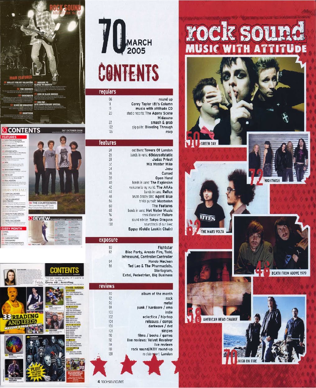
Contents Page and Double Page Spread Research

Similarities:
-Photo(s)
-Title at the top of the page
-List of contents
Differences:
-Q only has one image where as Kerrang! has a selection of different photos revealing what is with in the magazine.
-Kerrang! has an editorial introducing the reader to the issue, which could make them feel as if the magazine is addressed to them
-Kerrang! shows the option to subscribe to the magazine in the bottom right hand corner.
-Q has a definate house colour that is red which the majority of people know who have seen the magazine more than once, where as there is no set house colour for Kerrang! however they have used yellow through out this contents page.
-Q has an every month section where as Kerrang! just has 'This Week' and changes weekly.
-Q has a 100 greatest albums section in this issue which is highlighted as it would be the unique selling point for this issue, but then Kerrang! has the K! Awards special which would be the selling point for that issue.
What I will include on my own contents page:
-At least one photo showing what is to come in the following issue.
-Top ten songs of the decade
-Editorial
-Infected (the feature artist)
-Interviews paramore, void in context, you me at six, fall out boy, primus, tool
-Rory Bevis album
-Free posters
-Live reviews
-Competition
-Subscribe, with small thumbnail of magazine cover
-Single ladies, 100 most essential ladies singles
-Infected (the feature artist)
-Interviews paramore, void in context, you me at six, fall out boy, primus, tool
-Rory Bevis album
-Free posters
-Live reviews
-Competition
-Subscribe, with small thumbnail of magazine cover
-Single ladies, 100 most essential ladies singles
The main heading I will include on the front page, contents page and double page spread is the name of the band who are the feature artist. The genre of music this band produces will be rock, to go with the magazine and they person I will interview will be a well known bass player, who stands out in comparison to most bass players. I will use a talented artist so that more readers are interested, and I will use an attractive male to attract female readers too.

(Click to enlarge)
Above you can see a double page spread article produced by Kerrang! I like the fact the model is leaning downward and on the left side of the page, taking up the general side of the page and so I will use a similar pose for my double page spread. The mode of address in the article is very friendly and approachable, like a conversation, which will engage the reader and make them want to read on. This is done by including direct speech references making it seem as if the artist is actually talking to the reader. Colloquialism is used to relate to the way the reader talks making the article more user friendly e.g. 'emo'. They have included a quote above the main article to show what the main intention of the band is and to catch the readers attention and make them want to read on.
The page number and the name of the magazine have been included in the bottom right and left hand corner of the magazine. Two other photos have been placed under the article, which do not seem needed, but may have been entered as there was some space to fill and readers will want to see more pictures of the band to make it seem as if they are with them even more. A set of tracks produced by MCR are along the right hand side so that if readers are interested in hearing some new tracks they will immediately know there names and so will therefore more likely look them up.
The style of the double page spread is messy, revealing the creativeness of music.
What I will include with in my double page spread:
-A similar posed image to the one on the left
-Colloquial terms to relate to my reader, who I will later talk about the age of
-Direct speech in the friendly and approachable text to make the article seem like a conversation for the reader and making them want to read on
-The page number and name of the magazine at the bottom left of the page so that from the contents page the reader can easily find the article
-A quote at the top of the page to make it seem as if straight away the artist is talking to the reader
-The name of the artist at the top of the page so the reader can immediately identify who the article is on
-Text wrap around my model so that the text 'flows' around them in a messy style to reflect the creativeness of music
-Boxes of different heights for my columns of text to also give this messy look
Other contents and double page spreads that will help me design my own:
On the double page spreads I have included part of a Paramore article as this will help me in the production of my own double page spread article greatly.

Click to enlarge
Click to enlarge
Subscribe to:
Posts (Atom)