

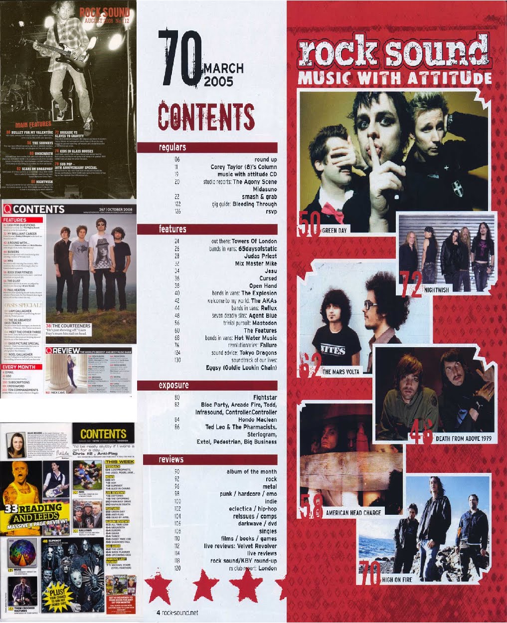
Similarities:
-Photo(s)
-Title at the top of the page
-List of contents
Differences:
-Q only has one image where as Kerrang! has a selection of different photos revealing what is with in the magazine.
-Kerrang! has an editorial introducing the reader to the issue, which could make them feel as if the magazine is addressed to them
-Kerrang! shows the option to subscribe to the magazine in the bottom right hand corner.
-Q has a definate house colour that is red which the majority of people know who have seen the magazine more than once, where as there is no set house colour for Kerrang! however they have used yellow through out this contents page.
-Q has an every month section where as Kerrang! just has 'This Week' and changes weekly.
-Q has a 100 greatest albums section in this issue which is highlighted as it would be the unique selling point for this issue, but then Kerrang! has the K! Awards special which would be the selling point for that issue.
What I will include on my own contents page:
-At least one photo showing what is to come in the following issue.
-Top ten songs of the decade
-Editorial
-Infected (the feature artist)
-Interviews paramore, void in context, you me at six, fall out boy, primus, tool
-Rory Bevis album
-Free posters
-Live reviews
-Competition
-Subscribe, with small thumbnail of magazine cover
-Single ladies, 100 most essential ladies singles
-Infected (the feature artist)
-Interviews paramore, void in context, you me at six, fall out boy, primus, tool
-Rory Bevis album
-Free posters
-Live reviews
-Competition
-Subscribe, with small thumbnail of magazine cover
-Single ladies, 100 most essential ladies singles
The main heading I will include on the front page, contents page and double page spread is the name of the band who are the feature artist. The genre of music this band produces will be rock, to go with the magazine and they person I will interview will be a well known bass player, who stands out in comparison to most bass players. I will use a talented artist so that more readers are interested, and I will use an attractive male to attract female readers too.

(Click to enlarge)
Above you can see a double page spread article produced by Kerrang! I like the fact the model is leaning downward and on the left side of the page, taking up the general side of the page and so I will use a similar pose for my double page spread. The mode of address in the article is very friendly and approachable, like a conversation, which will engage the reader and make them want to read on. This is done by including direct speech references making it seem as if the artist is actually talking to the reader. Colloquialism is used to relate to the way the reader talks making the article more user friendly e.g. 'emo'. They have included a quote above the main article to show what the main intention of the band is and to catch the readers attention and make them want to read on.
The page number and the name of the magazine have been included in the bottom right and left hand corner of the magazine. Two other photos have been placed under the article, which do not seem needed, but may have been entered as there was some space to fill and readers will want to see more pictures of the band to make it seem as if they are with them even more. A set of tracks produced by MCR are along the right hand side so that if readers are interested in hearing some new tracks they will immediately know there names and so will therefore more likely look them up.
The style of the double page spread is messy, revealing the creativeness of music.
What I will include with in my double page spread:
-A similar posed image to the one on the left
-Colloquial terms to relate to my reader, who I will later talk about the age of
-Direct speech in the friendly and approachable text to make the article seem like a conversation for the reader and making them want to read on
-The page number and name of the magazine at the bottom left of the page so that from the contents page the reader can easily find the article
-A quote at the top of the page to make it seem as if straight away the artist is talking to the reader
-The name of the artist at the top of the page so the reader can immediately identify who the article is on
-Text wrap around my model so that the text 'flows' around them in a messy style to reflect the creativeness of music
-Boxes of different heights for my columns of text to also give this messy look
Other contents and double page spreads that will help me design my own:
On the double page spreads I have included part of a Paramore article as this will help me in the production of my own double page spread article greatly.

Click to enlarge
Click to enlarge
No comments:
Post a Comment